Why Every App Now Looks the Same
By Kate Willis on May 17, 2026
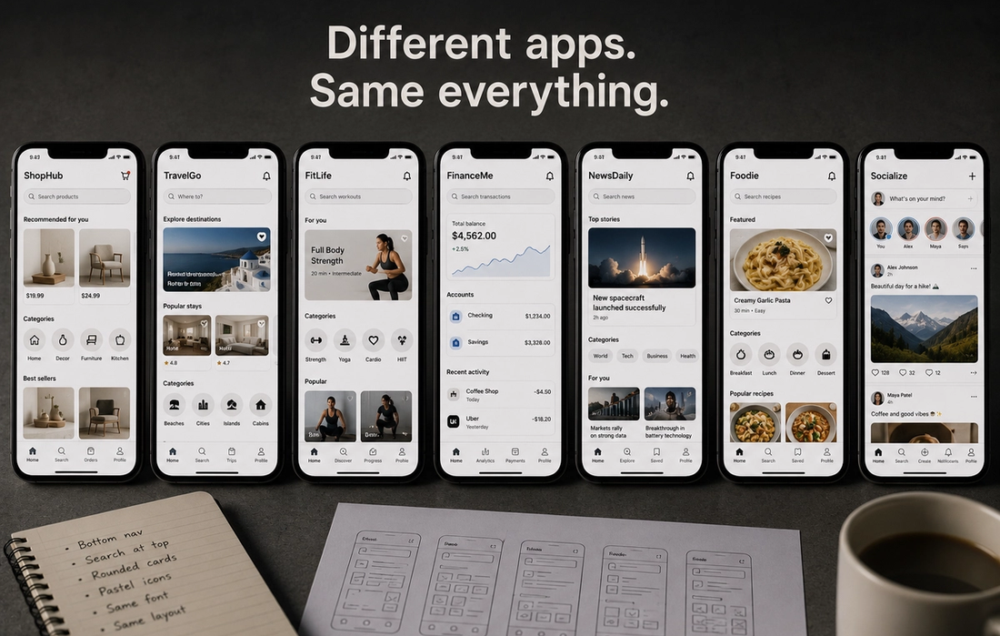
Open almost any modern app and the experience starts feeling strangely
familiar.
Rounded buttons. Minimalist icons. Soft gradients. Clean white backgrounds. Bottom navigation bars. Simple fonts. Muted colors. Smooth animations.
Whether it is a banking app, dating app, food delivery service, or social platform, many digital products now look almost identical.
At first, this uniformity seems practical. Similar designs make apps easier to use because users already understand the layout. But over time, something else happened: the internet and mobile apps slowly lost much of their visual personality.
The modern digital world became cleaner, simpler — and in many ways, more visually repetitive.
Key Takeaways
- Modern apps prioritize familiarity and usability
- Minimalist design trends heavily influence app development
- Companies optimize interfaces to reduce friction and increase engagement
- Standardized design helps users navigate apps more easily
- Many people miss the creativity and uniqueness of older internet design
Simplicity Became the Golden Rule of Design
One major reason apps look similar is because simplicity became one of the most important goals in tech design.
Early websites and software often looked chaotic. Bright colors, unusual layouts, textured buttons, and experimental visuals were everywhere. While creative, many older interfaces were also confusing and inconsistent.
Modern design philosophy moved in the opposite direction.
Companies realized users preferred apps that felt intuitive immediately. Cleaner layouts reduced confusion, improved accessibility, and made products easier to navigate across different devices.
Minimalism slowly became the industry standard.
Smartphones Changed Everything
The rise of smartphones heavily influenced app design.
Small screens forced developers to simplify interfaces. There was less space for complicated menus, decorative visuals, or cluttered layouts.
Designers began prioritizing:
- Large touch-friendly buttons
- Simple navigation
- Clear typography
- Fast loading times
- Consistent layouts
Over time, certain patterns proved effective and spread across nearly every app category.
Once users became familiar with those patterns, companies had little incentive to experiment too much.
Big Tech Companies Shaped Modern Design Trends
Apple, Google, and other major tech companies heavily influenced how modern apps look today.
Apple pushed sleek minimalism and clean interfaces through iOS design. Google introduced Material Design, which standardized animations, layouts, and interaction systems across Android apps.
These systems made development easier and created consistency between apps.
But they also encouraged uniformity.
Developers increasingly followed the same design frameworks because:
- Users already understood them
- They reduced usability problems
- They sped up development
- They felt “modern”
As a result, many apps started blending together visually.
Algorithms and Engagement Influence Design Too
Modern app design is not only about aesthetics. It is also deeply tied to user behavior.
Tech companies study how people interact with interfaces constantly. Small design decisions are tested extensively to maximize:
- Screen time
- Click-through rates
- User retention
- Engagement
- Purchases
If a certain layout keeps users scrolling longer, other companies often copy it.
This is one reason so many apps now use endless feeds, swipe gestures, and notification systems that feel nearly identical across platforms.
Design became heavily optimized around behavior rather than originality.
Safe Design Feels Less Risky
Large companies usually avoid risky design choices.
When millions of users rely on an app daily, dramatic visual experimentation can frustrate people or hurt usability. Familiarity feels safer from a business perspective.
That is why many apps follow the same predictable design language.
A banking app does not want users confused. A shopping app wants purchases to feel effortless. A social media platform wants users navigating content instantly.
Consistency reduces friction — but it can also reduce personality.
People Miss When the Internet Felt More Creative
Part of the frustration comes from nostalgia for a more visually diverse internet.
Older websites and apps often looked strange, personal, experimental, or even messy. Not everything followed the same design rules.
Today’s internet feels cleaner and more professional, but sometimes also less memorable.
Many users now miss:
- Unique visual identities
- Experimental layouts
- Distinct app personalities
- Playful design choices
- Creative weirdness
The polished modern web can occasionally feel emotionally flat because everything became so optimized.
Uniform Design Has Benefits Too
Despite criticism, modern app consistency does make technology easier to use.
People can switch between apps quickly because interaction patterns remain familiar. Accessibility also improved significantly through cleaner interfaces and clearer navigation systems.
For many users, convenience matters more than artistic uniqueness.
The issue is not that modern design is bad — it is that optimization gradually pushed individuality into the background.
The Future May Bring More Personality Back
Interestingly, some newer apps and websites are starting to move away from extreme minimalism again.
Designers are experimenting with:
- Retro aesthetics
- Playful interfaces
- More expressive typography
- Bolder colors
- Personalized layouts
As users grow tired of overly polished uniformity, there is increasing interest in making digital experiences feel more human and distinctive again.
Technology often moves in cycles. After years of sameness, creativity tends to return eventually.
Because while clean design may improve usability, people still crave personality — even in the apps they use every day.